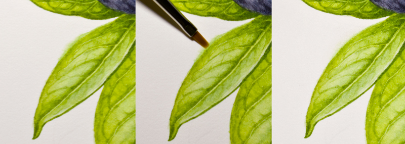
Pages

Saturday 29 November 2014

Paphio praestans: Back to Indonesia

While preparing for my return to Indonesia for good, I managed to paint this before leaving Sheffield. I have received too much blessings while living in the UK, which I lose count, but the most important one is my journey through botanical arts. I am not sure how my new-found love for botanical art will survive Indonesia since finding botanical art societies, even fellow artists, will be difficult in my home country. However, let's worry not. Instead, I thank for all things life has given me. Hence, I'd rather think about many intriguing plants in Indonesia waiting to be painted!

This is a painting of Paphiopedilum praestans, lady slipper orchid from Papua, Indonesia, based on my study sketch and photographs of the specimen I did last year. Somehow having a baby changed my initial plan on how to paint it. I left my previous sketch of a complete plant (with leaves and roots), then drew a new sketch driven by my current feelings. If you notice it, I paint the blossomed flower to pose as if hugging the bud. Have I become such a sentimental painter now?

"The Old and The Young I", Paphiopedilum praestans. Watercolours on Fabriano Artistico HP paper.

Sunday 16 November 2014

Saying Goodbye to The Florilegium Society in Sheffield.

With Valerie Oxley, the chairman of The Florilegium Society - Sheffield
It's been taking me forever to write a farewell to Sheffield, especially The Florilegium Society, where I learn painting botanical arts.

My limited language cannot express how blessed I feel to meet the Florilegium Society (and NSBA as well) during my short life in Sheffield and how lucky I am to know botanical art and to learn it from the best and passionate artists.

I am keeping my fondest memories of those first times when many of them encouraged me to join the societies, at our first meeting. And I am very happy that I took the chance (no matter how intimidated I was with the quality of their works), because not only that they got me through all the hoops of making botanical arts, they also offered warm friendships beyond my expectation. Being part of the societies has been one of the best part of my life. It also has brought about a big leap of my creative journey.

I can hardly believe that the time is coming to an end and I will be going back to Indonesia for good.
I will miss them but I hope to see them again someday.

P.S. Huge thanks to the Florilegium Society for the unexpected gift, the precious set of 108 tubes of watercolours and beautiful brushes. I will treasure and make the best use of them in my paintings. xx

Saturday 27 September 2014

[Tips] Blueberries: Painting Bloom and Correcting Mistakes in Watercolour

Painting Bloom 

Painting something new is always challenging. Case in point, painting blueberries for the first time gave me the heebie-jeebies. I racked my brains quite long to find a way to do the shine and the bloom (the thin white coating of powdery wax on berries) right. Thanks to Sigrid Frensen for her post on painting the grapes, finally I could muster my will to do it. I could imagine how to apply the watercolour layer by layer from her painting better than from photo references.

Since I am bad at remembering, I write these steps to help myself remember. At the same time, I hope you find it useful someday.

Watercolours I used: (all W&N) 
- Cobalt Blue
- Payne Grey
- French Ultramarine
- Indigo
- Alizarin Crimson

Steps I took:
1. I based the whole fruits with diluted Cobalt Blue unevenly. I left some parts of the white paper unpainted for the brightest highlight.
2. I built the shape using wet into wet washes of Payne Grey, but left some parts pale for the bloom. Later, I darkened the bloom with another wash of Cobalt blue.
3. I used either a mixture of French Ultramarine and Alizarin Crimson, or Indigo and Alizarin Crimson for the darkest areas. I left some edges a bit paler to give them the effect of light reflection.
4. With dry brush, I added some details and created the "scratch" effect of the bloom using Payne Grey or the no. 3 mixture. And viola! It was done faster and not as hard as I thought it would be. Instead, it turned out to be fun! 
[Insights] The dry brush technique for the scratch effect of the bloom was the most fun part! I did it randomly and the effect still managed to look natural.

Correcting Watercolour Mistakes with Flat Brushes 

As I wrote here, a good watercolour paper usually has a robust surface that it forgives some mistakes. I, quite often, lift watercolour paints or correct mistakes using my old Proarte 106, flat 1/8" sized brush (see picture below, the black handle). However, the brush wore off quite fast in a couple months. The hair ends were bent, losing their accuracy of correction. FYI, I saw Billy Showell has similar brushes in her demonstration; it was called the eradicator brushes.

In addition to that brush, I have other brushes for fixing for more precise point, the cheap, flat, 00 sized brushes (see picture, the red handles), which I got from a clearance sale. As you can see in the picture, they are much smaller than my 1/8" sized brush, which usually is the smallest size of flat brushes.
They are also less thick that I can lift paints more precisely. The hairs are synthetic and quite stiff to rub papers and lift paints. They also stay in good shape longer than my 1/8" sized brushes. If you are curious why the rightmost brush is shorter, it is because I cut it with scissor. I use the stiffer hairs for the toughest stains since it is more abrasive to papers.

[Tips] I wet the area to be removed or corrected with clean water by stroking a damp brush gently, then pat the pigment away with a kitchen towel/paper.

[Tips] I lift paints using my "broken" 1/8" sized brush for a soft-edged result, e.g. to enhance highlights. In the meantime, I use the 00 sized brush for the sharper edges, e.g. to remove paints that go beyond the outlines (see pictures below) or to create lines or vines of leaves when the paint is not completely dry.
The illustration was quite small, about 10 x 10 cm, hence it was not very detailed. It is one of the 15 illustrations of ingredients and nature elements I did for Ibaco ice cream's serving cup. The project was fun, supervised by a kind art director, Diya Pallikal of Rubecon.

*Please visit my behance to see more illustrations of the project :) Enjoy!

Tuesday 23 September 2014

[Tips] Magnolia: Painting White Flowers

Mixing 3 primary colour paints will produce richer "grey" than using only diluted single black/grey pigment to paint white objects. As I mentioned here, the mix consisted of 2 parts of French Ultramarine, 1 part of Cadmium Yellow Pale, and 1 part of Cadmium red deep. I added a small amount of other paint that matched with the object's hue, e.g. Permanent Rose for the Magnolia and the Hydrangea, or Cadmium Lemon for the snowy wood-rush (illustration in the middle). 
[Insights] Those 3 paints of basic mix didn't mix together long, they would separate out.  It meant I needed to stir it again soon before applying it on paper. You can even expect them to separate again on paper if the wash is really wet. However, I liked the "separated" effect especially when the granulating french ultramarine came out in this Magnolia illustration. The shadow tone looked rich and it lent the leathery effect of the petals, too.

In addition, I used white gouache for the fine hair of the buds. [Tips] I mixed white gouache with yellow watercolour, hence it blended nicely with the whole illustration. If not, the white gouache tended to look bluish.


And here is the scanned image of the Magnolia. It is one of the 4 illustrations I made for Rathbone Square Garden. Please visit my Behance to see the complete illustrations. Cheers :)

Friday 19 September 2014

[Commission] Rathbone Square Garden - London W1

I worked on 4 illustrations for Rathbone Square's brochure. The illustrations were created to show the key plantings of their garden. I will write a tip or two on other post. Please check out the complete illustrations on my Behance.

**Thank you, Heavenly and Great Portland Estates for having me in this great project!


Tuesday 15 July 2014

Rose Petals: Playing with New Colours

Finally I've got the reason to try some new paints I bought long time ago. The reason was a bunch of rose petals of Sheffield Botanical Garden. Quite simple objects to play with colours.

Before I painted them, I compared the petals' colours side by side with my radial colour charts/wheels. I singled out the closest colours by rotating them out from the stacks.

The new paints I used:
1. Daniel Smith Quinacridone Red for the red splotch of white round petal (see the middle left petal in the final work).
2. W&N Red Deep for the colour mix of the middle bottom red petal. It has a wide tonal range and spread in wetted area smoothly.
3. W&N Scarlet Lake for the colour mix of the reddish-orange petal in the center. A very vibrant colour!
4. W&N Quinacridone Magenta
5. W&N Permanent Magenta.

Sadly, I failed to digitalise the painting :( I tried to scan it several times but the vibrant reds kept losing the details and made ugly, uneven gradations. This is what I can share from my camera. Enjoy! :)

Thursday 10 July 2014

A Painting Class with Rachel Pedder-Smith

Thanks to Husband for taking care our baby. Hence, I could enjoy my "me time" by joining Rachel Pedder-Smith's workshop. It was held by the Florilegium Society in Sheffield Botanical Garden on Monday, 7 July 2014.

In the beginning, Rachel presented a very interesting slideshow and prints of her works. I was mesmerised mostly by her paintings of the herbarium specimens (dried-pressed plants) of the Kew Garden. They are massive and GRAND (I do mean it when I say grand!). One of them was a 5 meters long. It contained very well composed of 700 specimens of 504 families of the plant kingdom. It was a fascinating assortment, from tiny Amborella (the oldest and most “primitive” plant family) to a leaf of passion fruit that was collected by Charles Darwin himself. She explained that it took 766 days to complete this scientifically accurate and exquisite painting. What a labour of love! *Please check this out to see how fascinating the work.

Rachel did a quick demonstration of painting an Afzelia seed before she gave us 2-3 hours and her favorite paper, Saunders Waterford hot pressed paper, to work on our seeds/pods under her care.

And I painted these.. :)


Saturday 7 June 2014

[Tips] Making Radial Colour Charts

An idea hit me 2 days ago when I saw a pile of my leftover watercolour papers. What if I can turn them into a radial colour chart? After a little research on how to make a stack of papers rotatable, I made some for my self and I think it is a fun activity to share with my fellow botanical artists. The colour charts are really useful for our painting reference and, as we all know, we need to manage a load of colour charts, which keep growing over the time.
Tools: Cutter, ruler, hole punch plier, split brassed paper fastener.

Step by step:
1. I cut my favorite watercolour papers, Fabriano Artistico 140lb, into 2x6 cm pieces using a cutter and a ruler. I chose the form of small tags to make the best use of the leftovers :p
 

2. I made clean, 2.5 mm-sized holes with a punch plier (usually for leather belt) on the deckle-edged side of the paper.

3. I applied the paint on the other edge of the paper (to the very edge!) and write the colours' name soon, for fear of being buried in a pile of unnamed colour tags.


4. I arranged the colours by tone and fastened them with the split pin/brassed paper fastener. Since a cover would be a nice touch, I painted the cover with many colours to represent the content of the chart.

I have never made a colour chart before. Instead, I used to mixing and testing colours on an unused paper when I painted and throwing it after the painting was done. I also couldn't really use the common, tile-system colour chart because I couldn't make a side-by-side comparison between each of the colours and the object I painted. To me, the physical juxtaposition was important in finding the right colour. Yet, the tile-system colour charts did not help much in singling out the right colour. Then, I remembered the Pantone's colours chart and I thought that a radial watercolour chart was what I wanted all along.
 

Now, I really enjoy my radial watercolour chart! I can compare the colours side by side just by rotating them or put it side by side to the object of painting. I can add new colours or rearrange the stack easily because the split pin can unlock and lock without a sweat. I can also write additional note on the rear side. I can release the picked colour from the stack if I needed to. Well, am I easy to be satisfied or what? :p

*I made the blue, purple, yellow, and green colour chart as well and I will enjoy making the earth colour chart as well as any other colour in the future.

Tuesday 15 April 2014

[Commission] Vinos del Paseante - CODORNÍU S.A.

Finally the wine set with my illustrations on them were launched this month. I will write about the process on other posts. To see the complete illustrations, please visit my Behance. Thank you, Miquel Capo and Xavier Bas for having me in this exicting project!


[Tips] Painting Furs Quickly with Comber Brushes

I worked on some illustrations for Codorníu S.A. under the direction of Miquel Capo of Xavier Bas Disseny, generally in 2 steps. First, I blocked all the designated spaces with wet washes. And, later, I built up the figure with many layers of fur and feathers, using a very dry brush strokes.

I painted them mostly in dry brush in order to imitate the paintings style of Mr Alexander Marshal, an English entomologist, gardener, and botanical artist from XVII century.

I was not used to work with dry brush. I did it by trial and error. When I worked on "El Pispa," the goldfinch bird illustration, I got quite frustrated with how long it took to build up the body of the bird with a small round brush. I even wore out my two favourite brushes. Fortunately, I bought 2 comber brushes from Rosemary afterward, which I used to work on the next illustration, "La Pelea." The brush has unique shape that can create many tiny strokes at once. It made the work of painting the furs much quicker and easier.

Some insight I gained in the process:
1. Adjust the dryness on a different paper to create separated fur at once.
2. Combine the round and comber brushes for natural variability. I used a comber brush for wide area and a round brush to put down some details or correct the stray lines made by the comber brush.
3. Follow the fur direction and control the pressure. I lifted the brush up at the end of the stroke to make pointy furs/hairlines.
4. Since I didn't use white paint, I started from light and moved to dark colour. The highlights were effected by making fewer strokes on the area while adding more layers on the shadows.

I know the illustrations was not a perfect sample of realistic painting but I believe these comber brushes can greatly help to make it happen.

And here is the scanned illustration of La Pelea for Codorníu S.A. Enjoy!