Painting Bloom
Painting something new is always challenging. Case in point, painting blueberries for the first time gave me the heebie-jeebies. I racked my brains quite long to find a way to do the shine and the bloom (the thin white coating of powdery wax on berries) right. Thanks to Sigrid Frensen for her post on painting the grapes, finally I could muster my will to do it. I could imagine how to apply the watercolour layer by layer from her painting better than from photo references.Since I am bad at remembering, I write these steps to help myself remember. At the same time, I hope you find it useful someday.
Watercolours I used: (all W&N)
- Cobalt Blue
- Payne Grey
- French Ultramarine
- Indigo
- Alizarin Crimson
Steps I took:
1. I based the whole fruits with diluted Cobalt Blue unevenly. I left some parts of the white paper unpainted for the brightest highlight.
2. I built the shape using wet into wet washes of Payne Grey, but left some parts pale for the bloom. Later, I darkened the bloom with another wash of Cobalt blue.
3. I used either a mixture of French Ultramarine and Alizarin Crimson, or Indigo and Alizarin Crimson for the darkest areas. I left some edges a bit paler to give them the effect of light reflection.
4. With dry brush, I added some details and created the "scratch" effect of the bloom using Payne Grey or the no. 3 mixture. And viola! It was done faster and not as hard as I thought it would be. Instead, it turned out to be fun!
[Insights] The dry brush technique for the scratch effect of the bloom was the most fun part! I did it randomly and the effect still managed to look natural.
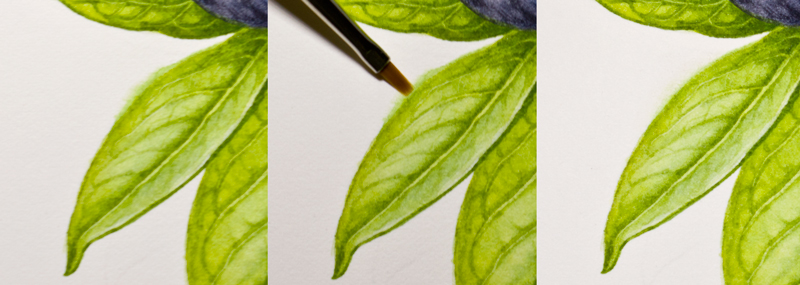
Correcting Watercolour Mistakes with Flat Brushes
As I wrote here, a good watercolour paper usually has a robust surface that it forgives some mistakes. I, quite often, lift watercolour paints or correct mistakes using my old Proarte 106, flat 1/8" sized brush (see picture below, the black handle). However, the brush wore off quite fast in a couple months. The hair ends were bent, losing their accuracy of correction. FYI, I saw Billy Showell has similar brushes in her demonstration; it was called the eradicator brushes.In addition to that brush, I have other brushes for fixing for more precise point, the cheap, flat, 00 sized brushes (see picture, the red handles), which I got from a clearance sale. As you can see in the picture, they are much smaller than my 1/8" sized brush, which usually is the smallest size of flat brushes.

[Tips] I wet the area to be removed or corrected with clean water by stroking a damp brush gently, then pat the pigment away with a kitchen towel/paper.
[Tips] I lift paints using my "broken" 1/8" sized brush for a soft-edged result, e.g. to enhance highlights. In the meantime, I use the 00 sized brush for the sharper edges, e.g. to remove paints that go beyond the outlines (see pictures below) or to create lines or vines of leaves when the paint is not completely dry.
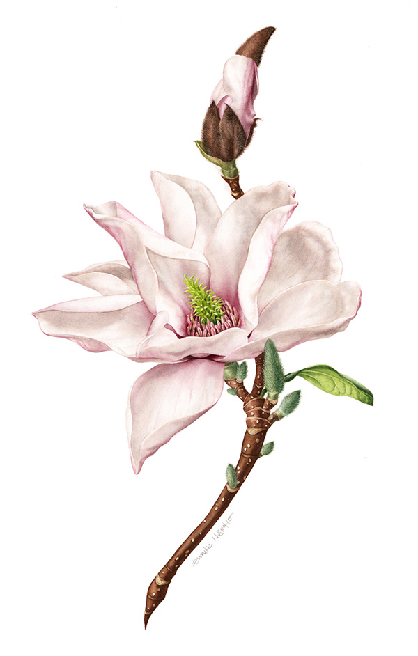
 The illustration was quite small, about 10 x 10 cm, hence it was not very detailed. It is one of the 15
illustrations of ingredients and nature elements I did for Ibaco ice cream's serving cup. The project was fun, supervised by a kind art director, Diya Pallikal of Rubecon.
The illustration was quite small, about 10 x 10 cm, hence it was not very detailed. It is one of the 15
illustrations of ingredients and nature elements I did for Ibaco ice cream's serving cup. The project was fun, supervised by a kind art director, Diya Pallikal of Rubecon.*Please visit my behance to see more illustrations of the project :) Enjoy!