Pages

Friday 27 February 2015

[Commission] Süddeutsche Zeitung Magazin

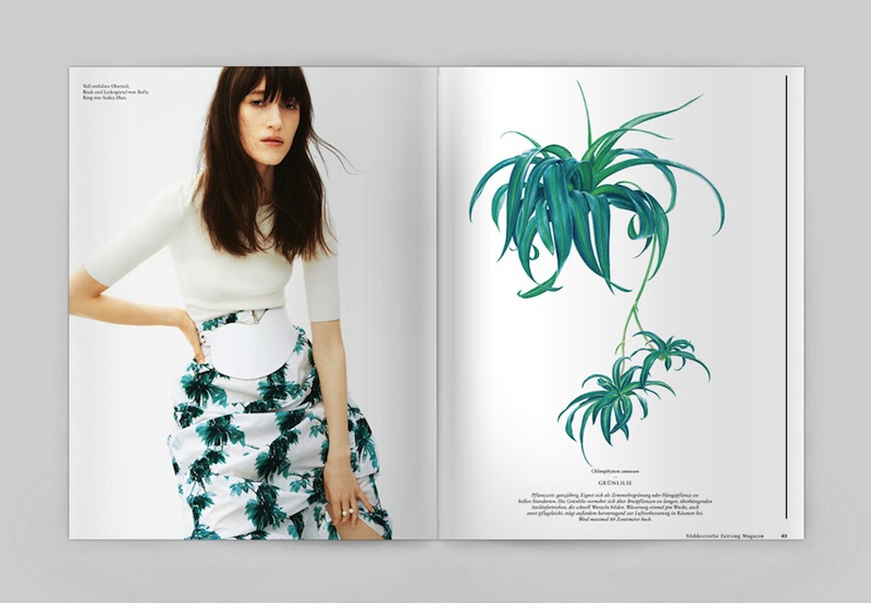
I could be out of my mind when deciding to work on a commission from Süddeutsche Zeitung Magazin. I had only about a month to work on 5 botanical illustrations and, at the same time, I and my family were moving from the UK to Indonesia for good. We had no house when we arrived in Yogyakarta and the contrasting weather was also a real problem for Nawang, my toddler. Mostly, where and when to paint were the big problem.

The twists and turns of my effort to paint in these chaotic period will take hours to tell! Let's skip it. I thank my family (especially husband) for making it possible and still love me after these months.

And now the magazine is out! Of course, it looks great! Just to see some of my illustrations on the cover feels like all those hardworking days/nights is paid in full.

And taking a look at the fashion pages is such a pleasure. It is said, after a hurricane comes a rainbow. And indeed, the "rainbow" looks wonderful! Thank you, Ralf Zimmermann and Sarah Beckhoff, for having me in this great project!


Please check my behance to see the complete original illustrations. Thank you! :)

Credits
Photographer: David BornScheuer
Styling: Almut Vogel
Illustrator: Eunike Nugroho

Photo Assistant: Alex Orjecovschi, David Fitt | Digital Operator: Benjamin Roulet | Hair: Helene Bidard / Artlist |  Makeup: Kathy Le Sant / airport agency | Styling Assitentin: Anna Koppmann | Model: Helena Severin / Viva Models | Retouching: Christine Schubeck / Bird Imaging | Location: Studio Daguerre | Thanks to Studio LB Paris.

Saturday 7 February 2015

Blogger/Google Turned My Pictures Darker!

Actually it has been ages since I realised something was wrong with pictures uploaded from Google's Blogger. When uploaded, the pictures always turned darker. White background became grey and all my paintings became darker or more greyish. Many times I went back to my editing programme, made the pictures a bit lighter and uploaded them again, but, still, they turned darker. Eventually, I was just too tired and ignored the problem.

After my previous post of Painting Yellow and Defeating the Dullness, I couldn't take it anymore! Instead of showing the brightness of the yellow Sunflower, I got dull greenish yellow petals.

However, a quick internet browse solved the problem (I wish I did it earlier! T__T). Blame it to Google Auto Enhance, which claims "It makes subtle adjustments to help your pictures look great". Well, thanks, but NO THANKS! So if you have the same problem with me. Here is how to stop it:
1. Open Google+
2. Place your cursor over the Google+ logo on the top left corner. Click Settings.
3. Scroll down to Auto Enhance section and click it Off.

4. And replace your "enhanced" pictures with the same files from your computer.

I hope it helps you too! :)

Sunflower: Painting Yellow and Defeating the Dullness

Painting yellow flower was not my favorite thing. I used to ruin my yellow flowers with ugly shadows. Eventually, the glowing brightness of the real yellow flowers was lost.

Thanks to Sharon Tingey who shared her secret mix of colours in her demonstration and her Facebook post, I found a solution to my frustration of painting yellow flowers. And I hope she doesn't mind I write here how her great tips help me.

I know from experience that yellow flower is not as easy as red, pink, purple, or orange flowers to deal with. I used to stick with W&N Cadmium Lemon or Cadmium Yellow Pale for yellow flowers, whose result did not make me happy. I felt that the more layers I put to built shapes and shades, the less bright the yellow became. It was very tricky for me. A very tiny amount of wrong pigment in the mix would turn the whole flower dull. And the mistake was hard to hide.

But the misery ended after I watched Sharon's demonstration and saw how well she did her sunflowers (which won Gold Medals in RHS London Botanical Art Show 2014!). I bought and tried the same paint she used. And I felt very grateful that she shared her recipe! It was Daniel Smith Hansa Yellow Light (HYL). As you can see in the photograph above, which compares yellow colour chart, HYL is the brightest among other yellow colours I use. The DS site claims that the paint is cleaner, more transparent and brighter in chroma than Cadmium Yellow Light. Also I guess because HYL uses a single primary pigment, it helps us avoid a dull gray resulting from hidden complements when mixed.

A mix of HYL with W&N New Gamboge or Quinacridone Gold or and Perylene Maroon (for the darkest) really captures the brilliant yellow petals of sunflower.

And below is a scanned image of my Sunflower illustration. I hope you like it! :)

[Commission] Watercolour Illustrations for Kapal Api Coffee Packaging

It was a set of illustrations I did in the UK around 2013-2014. So it was a lovely surprise to see them in the real package on a supermarket's shelf in Yogyakarta. The illustrations were commissioned by Kapal Api, one of the biggest coffee producer and retailer in Indonesia. I would like to thank Kapal Api and Alegria for having me in this great project!

*I have just replaced the lousy picture from my cellular phone with this proper photograph of the coffee product from the client. And, here is one of the illustrations I made in the project.
** it will be nice to enjoy with a cup of coffee! :D