Pages

Showing posts with label Cat Air. Show all posts

Saturday, 7 February 2015

Sunflower: Painting Yellow and Defeating the Dullness

Painting yellow flower was not my favorite thing. I used to ruin my yellow flowers with ugly shadows. Eventually, the glowing brightness of the real yellow flowers was lost.

Thanks to Sharon Tingey who shared her secret mix of colours in her demonstration and her Facebook post, I found a solution to my frustration of painting yellow flowers. And I hope she doesn't mind I write here how her great tips help me.

I know from experience that yellow flower is not as easy as red, pink, purple, or orange flowers to deal with. I used to stick with W&N Cadmium Lemon or Cadmium Yellow Pale for yellow flowers, whose result did not make me happy. I felt that the more layers I put to built shapes and shades, the less bright the yellow became. It was very tricky for me. A very tiny amount of wrong pigment in the mix would turn the whole flower dull. And the mistake was hard to hide.

But the misery ended after I watched Sharon's demonstration and saw how well she did her sunflowers (which won Gold Medals in RHS London Botanical Art Show 2014!). I bought and tried the same paint she used. And I felt very grateful that she shared her recipe! It was Daniel Smith Hansa Yellow Light (HYL). As you can see in the photograph above, which compares yellow colour chart, HYL is the brightest among other yellow colours I use. The DS site claims that the paint is cleaner, more transparent and brighter in chroma than Cadmium Yellow Light. Also I guess because HYL uses a single primary pigment, it helps us avoid a dull gray resulting from hidden complements when mixed.

A mix of HYL with W&N New Gamboge or Quinacridone Gold or and Perylene Maroon (for the darkest) really captures the brilliant yellow petals of sunflower.

And below is a scanned image of my Sunflower illustration. I hope you like it! :)

Tuesday, 23 September 2014

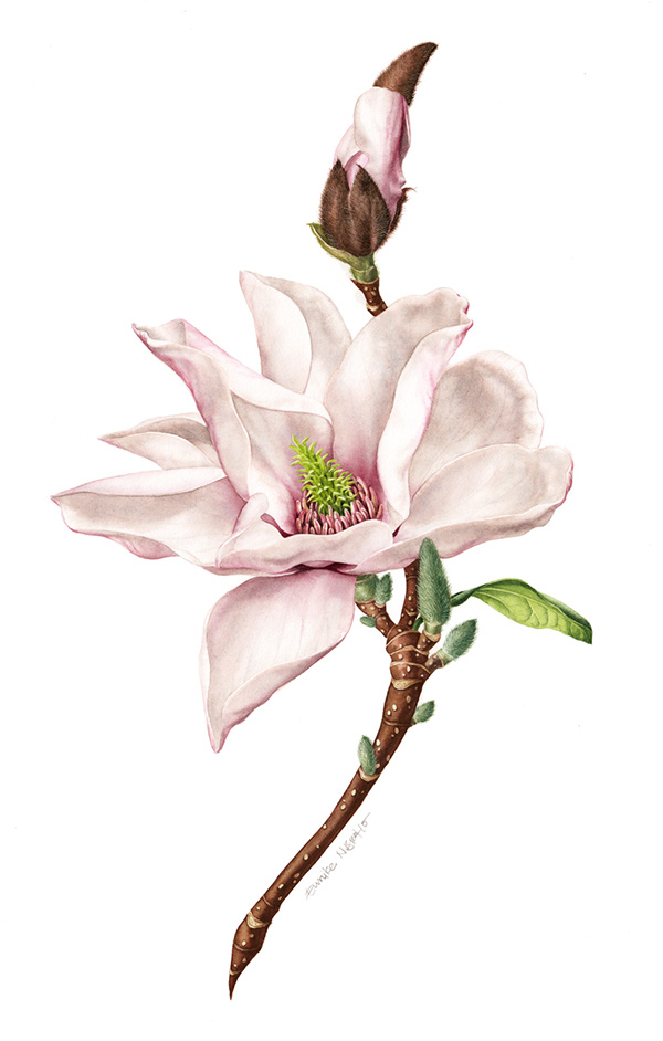
[Tips] Magnolia: Painting White Flowers

Mixing 3 primary colour paints will produce richer "grey" than using only diluted single black/grey pigment to paint white objects. As I mentioned here, the mix consisted of 2 parts of French Ultramarine, 1 part of Cadmium Yellow Pale, and 1 part of Cadmium red deep. I added a small amount of other paint that matched with the object's hue, e.g. Permanent Rose for the Magnolia and the Hydrangea, or Cadmium Lemon for the snowy wood-rush (illustration in the middle). 
[Insights] Those 3 paints of basic mix didn't mix together long, they would separate out.  It meant I needed to stir it again soon before applying it on paper. You can even expect them to separate again on paper if the wash is really wet. However, I liked the "separated" effect especially when the granulating french ultramarine came out in this Magnolia illustration. The shadow tone looked rich and it lent the leathery effect of the petals, too.

In addition, I used white gouache for the fine hair of the buds. [Tips] I mixed white gouache with yellow watercolour, hence it blended nicely with the whole illustration. If not, the white gouache tended to look bluish.


And here is the scanned image of the Magnolia. It is one of the 4 illustrations I made for Rathbone Square Garden. Please visit my Behance to see the complete illustrations. Cheers :)

Saturday, 7 June 2014

[Tips] Making Radial Colour Charts

An idea hit me 2 days ago when I saw a pile of my leftover watercolour papers. What if I can turn them into a radial colour chart? After a little research on how to make a stack of papers rotatable, I made some for my self and I think it is a fun activity to share with my fellow botanical artists. The colour charts are really useful for our painting reference and, as we all know, we need to manage a load of colour charts, which keep growing over the time.
Tools: Cutter, ruler, hole punch plier, split brassed paper fastener.

Step by step:
1. I cut my favorite watercolour papers, Fabriano Artistico 140lb, into 2x6 cm pieces using a cutter and a ruler. I chose the form of small tags to make the best use of the leftovers :p
 

2. I made clean, 2.5 mm-sized holes with a punch plier (usually for leather belt) on the deckle-edged side of the paper.

3. I applied the paint on the other edge of the paper (to the very edge!) and write the colours' name soon, for fear of being buried in a pile of unnamed colour tags.


4. I arranged the colours by tone and fastened them with the split pin/brassed paper fastener. Since a cover would be a nice touch, I painted the cover with many colours to represent the content of the chart.

I have never made a colour chart before. Instead, I used to mixing and testing colours on an unused paper when I painted and throwing it after the painting was done. I also couldn't really use the common, tile-system colour chart because I couldn't make a side-by-side comparison between each of the colours and the object I painted. To me, the physical juxtaposition was important in finding the right colour. Yet, the tile-system colour charts did not help much in singling out the right colour. Then, I remembered the Pantone's colours chart and I thought that a radial watercolour chart was what I wanted all along.
 

Now, I really enjoy my radial watercolour chart! I can compare the colours side by side just by rotating them or put it side by side to the object of painting. I can add new colours or rearrange the stack easily because the split pin can unlock and lock without a sweat. I can also write additional note on the rear side. I can release the picked colour from the stack if I needed to. Well, am I easy to be satisfied or what? :p

*I made the blue, purple, yellow, and green colour chart as well and I will enjoy making the earth colour chart as well as any other colour in the future.

Tuesday, 15 April 2014

[Commission] Vinos del Paseante - CODORNÍU S.A.

Finally the wine set with my illustrations on them were launched this month. I will write about the process on other posts. To see the complete illustrations, please visit my Behance. Thank you, Miquel Capo and Xavier Bas for having me in this exicting project!


Tuesday, 10 December 2013

Japanese Chrysanthemum: Continuing an Unfinished Artwork.

More than a year ago, I found a lovely specimen of Japanese chrysanthemum. I made the sketch and painted most part of the flowers. I stopped working on it when I had too many things to do between our moving back from the UK to Indonesia and my pregnancy. Last week, I decided to finish this unfinished work. And these are some little insights during the process.

I found that the paper's characteristics somewhat changed. It was more absorbent and its surface was not as robust as I remembered. I realised it when I used the wet washes and lifting technique frequently. I wonder whether it changed since I brought it back to Yogyakarta and neglected it for about 7 months.

I am still wondering how to solve the humidity problem in the tropical Indonesia. The Japanese Chrysanthemum was not the only one that had been affected. I faced the same problem when working on the Paphiopedilum glaucophyllum orchids. Not to mention my shocking encounter with the massive mold attack on my other drawings when I left them on the hardboard for 4 days only (when I was in the hospital, giving birth to my baby). The weather was so humid, it seemed to pose the watercolour paper with many risks. Does anyone of my kind readers here have any idea as to how to solve the problem?

Back to the unfinished painting, I tried some new green mixing I learnt from artistnetwork. I bought Winsor & Newton Permanent Sap Green and I found it was easy to mix with my existing colours. But what made me happy was that the sap green mixing was not as staining as Winsor Blue (green shade) that I usually use. It made lifting the pigment easier both when the paint was still wet/damp and when it completely dried. I mixed sap green with French Ultramarine to get a dark green, or Cadmium Lemon/ Cadmium Yellow Pale to get the bright one. And a little touch of Alizarin Crimson, if needed.

Another new thing I tried was using kolinsky sable brushes as my main tool. I decided to invest in Raphael series 8404 no 2 and 4 after Billy Showell's demonstration. I found the natural brushes was very different from my existing synthetic one (mostly Pro Arte series 101). Here are my first impressions of using Raphael kolinsky sable brushes:

1. They are bigger than the synthetic ones with the same number size. The Raphael size 4 is even a bit bigger than my Pro Arte size 6.

2. They have much bigger capacity to hold water. It is good for glazing/washing big area, on the other hand, it requires more watercolour mixing prepared. [Tips] Use a cheap/discarded brush to pick up pigments and mix watercolour rather than using an expensive sable brush.

3. They release water/paints slower but more evenly. So they tend not to dump water/paints in a puddle.

4. The tuft/hair is softer and bend more easily (or somewhat a bit defenselessly for me).

5. The brushes' tip do not naturally point out when dry (whereas the synthetic do) and need to be reshaped when wet (whereas the synthetic needn't). I was aware of it since I saw Billy kept twirling her brushes' tip on a kitchen towel after she dipped them in water/paints.
[Tips] I reshape the brush by loading the brush with water, then shaking the excess vigorously with my elbow or tapping the brush handle with my other hand before I dip it in the watercolour mixing. I usually have the brush tip very pointed afterward without touching my finger on it.

The kolinsky sable brushes are not cheap, but at least now I know the difference between them and the synthetic ones. I need much more practise to feel more comfortable with them. However, as other people said: knowing how to best use what you have is more important than the "tool" itself. Cheers!

Another post about taking care watercolour brushes is here.


And here is the scanned illustration.
28 x 38 cm - 300 gsm traditional white HP Fabriano Artistico paper.


Thursday, 28 November 2013

Saturday, 12 October 2013

[Tips] How to Transfer a Drawing using Tracing Paper

The idea is simple. The transparency of tracing paper allows me to precisely copy a sketch to the "real" paper.

By keeping the watercolour paper clean, I can sketch and revise as many as I want, for example, to accommodate the client's requests. Sketching directly on the "real" paper will leave too many erases and pencil scratches on the otherwise good watercolour paper. The other advantage is that I can transfer the sketch already coloured, or only necessary lines.

Here are the tools I need:
1. Tracing papers
2. Pencils or water soluble colour pencils to coat the other side of paper
3. A very pointy and hard pencil (e.g. 2H - 4H) to trace the drawing
4. (Optional) Eraser, pencil sharpener, kitchen towel, sandpaper.

And here are the steps:
1. Once a sketch was approved by client, I scanned and then printed it on a tracing paper. Again, it saved me another time from transferring a drawing twice from sketch pad to a tracing paper then to a watercolour paper. It was also less messy because it prevented me from smearing the watercolour paper with pencil dust that clings on my palm. Another tips to avoid pencil dust: Place clean paper between your hand and tracing paper if you aren't going the scan-print route. 

2. To coat the blank side of the tracing paper quickly, I held the pencil almost completely sideways then spread the mark with a kitchen towel. This helped me to gain an even outline like I draw directly on the watercolour paper with 2H pencil. 
My tips: For delicate botanical illustration or light coloured object, use water-soluble colour pencils with similar colours to those of the final paints to coat the backside of the tracing paper. This would save you some time from erasing it as it leaves no trace of pencil. On the other hand, when I paint less detailed or dark coloured object, I use graphite pencil to coat the backside as I did in this Asian palm civet illustration.

3. I placed the tracing paper on top of a watercolour paper and secured it with masking tape before I traced the image with very pointy 4H pencil. I trace only necessary outline to the watercolour paper and I did it with a steady pressure.
My tips: Grind the pencil to sandpaper
almost completely sideways to keep it very sharp/pointy.

4. After I had completed tracing the drawing, I gently removed the tracing paper and drew necessary line for the missing part. And the watercolour paints were ready to GO!

Sunday, 4 August 2013

[Tips] How to Make Hard Edged Watercolour

Hard edges occur when water pushes paint to the edge of the wetted area and the paint forms thin 'outline' as it is drying. Usually I avoid it in my paintings, but in this illustration I made it on purpose. And I like it!

It was a commissioned illustration for a wedding invitation of a dog-lover couple, 'German Shepherds' to be specific.

The German shepherds have special characteristics, such as black nose, black mark near the eyes, and black 'saddle'-shaped mark on the back. And I thought these features were fitting for the hard edged style.

Here are a little insights I found when doing the hard edges effect:
1. I mixed a generous volume of water with less pigment to make a thin mixture. When applying the mix I made an effort to control the shape of the wetted area.

2. I dropped more water in the colour when the area was still wet. It pushed the pigment to the edge of the area and made the outline more striking.

3. I positioned the paper on a perfectly flat surface so that it created a uniformly sized outline.

4. To have a very fine outline, I avoided thick mixture. Too much pigment will make heavy, coarse outlines.

5. I made sure the area was completely dry before I put another hard edged washes and stroked the brush gently. The brush's pressure can scrape the previous outline.

I think there are many 'fun' possibilities for the hard edged watercolour as a stand-alone style or combined with other washes!

(Edited on 19/07/2014) I add the final artwork and a closer look to their eyes :)

Thursday, 18 July 2013

[Commision] Honeysuckle Illustration for Book Cover

I just saw the book ready for pre-order on Amazon, and I think it's the time to blog about the creative process of the illustration. It was a commission I worked on in the late autumn last year. I remember that it was a serious challenge for me, but with much excitement.

The biggest challenge was that I had never seen the real honeysuckle flowers! Born and grew in 2 seasons country Indonesia and lived only a year in the UK, yes, I saw countless 'first time to see' flowers in the Spring, in the Summer and fewer in the Autumn but never once I luckily bumped into honeysuckle flowers. Google provided many reference images, but I was afraid I could not paint it right when I didn't see the flower with my own eyes.

It was late of the Autumn, and it was reaaaally hard to find a honeysuckle plant blooming. After corresponding via e-mail with about 20 nurseries and florists, I managed to make a shortlist of potential sellers. I even sought an advice from a generous botanical painter, Jarnie Godwin, regarding the varieties that were possible to flower in the late autumn/winter. She helped this clueless illustrator by pointing some varieties and a reference of nursery. With the knowledge of the variety and my husband's calls to some sellers, later I found the only one 'Graham Thomas' honeysuckle that still flowered from a nursery in Buckingham. I bought it for almost five times more expensive than its price at the local supermarkets in the Spring/Summer. But I was very relieved to finally get it!

The plant came within 24 hours. I took some pictures of the flowers and showed them to the client. We both agreed that they were not in their prime time. But at least, I know 'whom' I dealt with. The inflorescence had intricate shape and many different parts and I think I was right to see it myself rather than only worked on its image reference.

Beside the real specimen, I also worked based on some image references because it was the dark pink-yellow-orange honeysuckle flowers that was wanted, not the white-yellowish 'Graham Thomas' I had.

First, I made 5-6 separate sketches of a inflorescence and composed them digitally to get the approval from the client. Out of 5 inflorescence of the brief, finally a sketch of 3 inflorescence was approved. Tracing paper is especially useful to consider the layout as I can easily move the object in different layers while still be able to see it.

I also used tracing papers to transfer the approved sketch onto 28x38 cm watercolour paper. As usual, I used water-soluble colour pencils to draw the outline/contour on the watercolour paper. This would save me some time from erasing as it leaves no trace of pencil.
[My tips] Use the similar colours as those of the paint.

Wet into wet was the most technique I used. I glazed the paper with clean water before applying the pigments. To create the highlight, I left a certain area of the paper white or lifted some of the paint with clean damp brush while the wash was still wet.

With a good watercolour paper, most watercolour pigment can be dissolved or lifted off after it has dried. A good watercolour paper is treated with a substance to reduce the cellulose absorbency. It makes the surface quite robust and forgiving of mistakes. It also makes the colour looks bright/clear since the pigment lays on the top of the surface.

In this illustration, I lifted off the permanent rose pigment when I made a little alteration of the flower bud.
[My tips] Wet the area to be removed with clean water by stroking a damp brush gently, then pat the pigment away with a tissue. Avoid using this technique for staining colors such as Prussian Blue, Alizarin Crimson, or Winsor colours. Check which the staining colours are (marked with "St") here.
[My tips] A flat brush works better than the round one for lifting the colour off. I use 1/8" synthetic flat brush for correcting a mistake.

For final touch, I used dry brush technique to create striking texture on some petals. And after all the pigments completely dried, I rubbed the masking fluid off from the paper and painted it as planned.

All the process was done within 2 weeks. Although the illustration is used only as a faint background of the book cover of 'The Sweetest Hallelujah' by Elaine Hussey, it was an exciting experience for me. It was the first time for me to work with renowned publisher, the Harlequin. It was the first time for me to see a beautiful honeysuckle flowers with my own eyes and to smell their fresh lemony-sweet fragrance all over my room. I think I can still remember how it smells. Heavenly!


Here is the scanned illustration.


Sunday, 14 July 2013

Hibicus Flowers: Loose Looks in Constrained Way

During my last days in Yogyakarta I meant to work on a painting of Hibicus flowers. It was a memento for Mr & Ms Jarret, who have generous enough to let us use their guest house during our stay in Yogya. The flowers were planted at the house and bloomed while I was staying there.

Since giving birth to Nawang, my 3 MO baby girl, I only had very few hours to paint so I decided to paint the flowers loosely rather than botanically.

Having the best time at 3.30 to 6 a.m. and a half or quarter of an hour or a few minutes while the baby awoke, in fact I worked on the loose looks in constrained way. I was ready to be interrupted anytime while painting. Because of the condition, sometimes I couldn't keep any eye on my watercolour washes. I tried to make only a single stroke or two that I predicted to look good and let it dry then check it out later after taking care of my baby.

I used much of wet into wet washes on this painting. I made certain area of paper wet with clean water then applied strokes or drops of pigment. Or sometimes I dropped water on a wet pigmented area. I love wet into wet washes; it was fun to see 'unexpected' results and those characteristic watercolour effects. I still can enhance (or correct) the colours by applying the same technique over existing washes after they were dry. | The Hibicus Flower was painted on A2 Fabriano Artistico HP paper with Winsor & Newton Artists' watercolours.